.png)
From start-up challenger in 2015 to becoming an industry leader, GetAccept is on a mission to redefine the way companies run sales. No question about that!
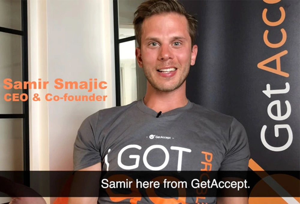
Our four founders, Samir Smajic, Mathias Thulin, Jonas Blanck, and Carl Carell have ever since 2015 done a fantastic job growing this company and pushing the boundaries within sales and product development. But it might be fair to say that the focus hasn't been as much on marketing and branding. Right, guys? When I was interviewing for the role as VP Marketing last year, I remember asking, “what about your brand platform, can I have a look?”
And the reply I got in return, “yes, sure here it is”
A logo. Check.
2 colors. Check.
Oh, and not to forget, the suits. With the same patterns as the TV test image. That's it.
Ok, I thought to myself, there is a job to be done.
Just like your personal identity makes you uniquely you, your brand identity is the special sauce of your business that sets you apart from every other company. It’s what shapes your company.
A brand identity is the collection of all elements that a company creates to portray the right image to its consumer. It is what makes us instantly recognizable to our customers. Our audience will associate our brand identity with our product, and that identity is what forges the connection between us and our customers, builds customer loyalty, and determines how our customers will perceive our brand.
In terms of identity, we already have a strong identity at GetAccept. As is the case in many founders’ led companies. Our identity sits in the walls, it's based on our company values, our vision and mission statement, and it gives us clear directions on how to act and be in all interactions internally and externally.
However, we haven't had anything concrete in terms of a brand playbook or any guidelines around visual identity, making sure our brand is consistent throughout everything we communicate and in every channel we are present.
Also, it's a fact that:
1. We have grown and become quite a big company. 2. We aim to make a big mark in the world
3. And we want to become a category leader
Therefore the time is now, and it's more important than ever, that we build a strong brand and an identity, to have that red thread making us look the same in everything we do while lining up with the bigger picture.
With that said, one of the key focus areas for marketing during this year has been to develop our brand identity and our platform.
This is a job that continues over time, but we have started with the basics to get the following into place:
- Brand traits and tonality
- Updated logo
- Color palette
- Fonts
- Imagery
- Icon library
- Graphical shapes
.webp?width=800&height=800&name=Brand_Concept_2%20(1).webp)
How did we do it?
In order to understand the personality and voice of GetAccept we decided to conduct research, interviewing and discussing with people both internally and externally. Based on the feedback and insights we gained the personality of GetAccept and our brand traits, came into words.
GetAccept is:
Professional - we have a business mindset and we are reliable, and respectful
GetAccept is Rebellious - we always strive to challenge, think crazy different and do things with an extra twist
GetAccept is Passionate - about sales, and about finding the best solutions for our customers and partners
GetAccept is Savvy - as in having high competence within SaaS, Sales Enablement and e-signing
Our tonality and the way we express ourselves is playful, and conversational but at the same time business-like, educational, and straight to the point.
Logo:
Changing the logo was probably the most difficult part in this process. There were many feelings connected to the logo which made us decide in the end that we didn't want to change it too much. The new Logotype, however, has softer edges making it more aligned with the font and the checkmark is more balanced in the circle making it easier to use standalone without the company name if needed.
Going from two brand colors to a full palette
In order to have more ways of expressing ourselves, we have increased the color palette from two colors to a range of color options.
We have adjusted the orange color so it feels more energizing. The orange is still our main color, but as a complement we have developed a selection of orange and gray shades to go with it. In addition to the orange and grey colors we have a secondary section with green and blue shades accompanying the orange adding more to our overall feel and personality. The color palette also consists of pink shades to be used on occasions when more color is needed. The colors are often used in gradients.
Overall, it's been important for us to have a color palette that is bright and colorful and not go into dark mode.
The font
We have a new font - Poppins; allows us to be playful, yet bold and at the same time elegant. It has a slight rounded feel to it even though it has sharp edges, which resonates with our personality and tone of voice.
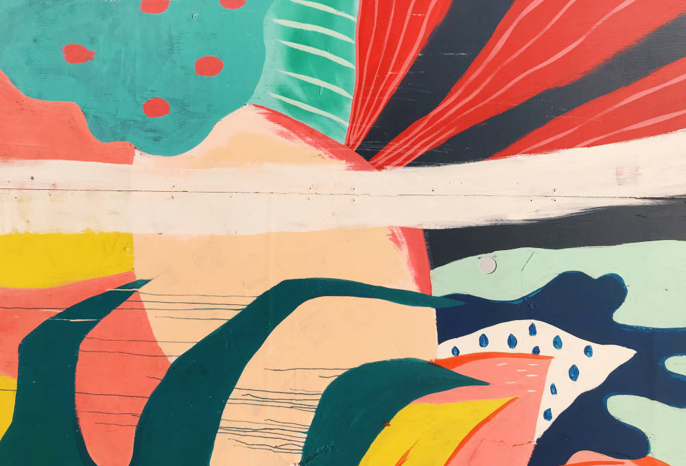
Graphical shapes
Based on big trends within B2B and design aspects we developed three graphical shapes to emphasize our playfulness:
- The Wave
- The Pentagon
- The Quadrangle
The wave is used as a top or an end to a block or a background. The other two shapes, the pentagon and the quadrangle could be filled with solid colors, gradients or a photo to emphasize for example a key message or a picture. Working with our shapes open up a lot of possibilities when it comes to design choices and placements. It makes our visual language more personal and characteristic.
Now, moving forward we will implement our new identity step by step. First out is a remake of our website, which is happening right now. The rest will follow, so stay tuned.